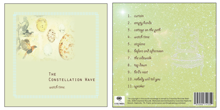
This music CD cover represents the front and back of a fictitious group called The Constellation Wave. It was created using both Indesign and Photoshop which allowed for a visually appealing end product. There was excellent readability because the dark font contrasted nicely with the soft background color. The border around the front design created clean lines and a way to bring the viewer’s focus on the graphic image. Feathering was used on the front design to create a softened look which was harmonious with the overall theme of the design. The white space on the page is also a technique that benefits visual appeal. The back cover is also uncluttered and visually appealing. A constellation was used for the background layer which was a creative way to incorporate the title. The track titles are in an easy to read format and also contrast the light green color. There is a very transparent chair on the left of the page which was kind of a funky and creative touch.
The message may not be delivered to the consumer in a literal matter, but the overall theme and visual appeal of the design certainly stand out among other CD covers. It is important to have consistency on both the front and back which are laid out in a very clear manner in this particular design.
Various design elements were used in the production of this CD Cover. For example, Direct Selection tool was used often to manipulate the graphic inside the frame. Also, indents and spacing were crucial for creating an effective layout of text. The record label logo and bar code were copied and pasted from Google Images. The copyright information was also duplicated from an example online.
Overall, this CD Cover was visually appealing without crowding the empty space with too many images. It was simple with a soft, acoustic feel. It would probably stand out to a consumer because of its unique style and charming simplicity.