Home ♦ About ♦ Sites
-
Design Pages
- Flyer
- CD Cover
- Postcard
- Logo
- Additional Work
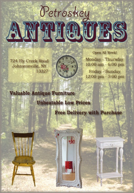
This business flyer advertises an affordable antique store. It is visually appealing because the design layout is symmetric with an eye catching format. For example, guides were used to ensure consistent spacing between each image. The first background layer is a transparent image of a forest, which remains congruent with the rustic theme of antique furniture. The fonts in the layer that follow are eye-catching and easy to read. For example, the location and time are laid out on top of a soft yellow rectangle. A drop shadow was placed behind the text to allow the message to stand out against the background image. Also, images of antiques give the future customer a visual sample of what to expect, which was a creative business strategy.
The effectiveness of imparting the message of the flyer to the intended audience is high in this piece. The images, font, colors, and actual message truly speak to a person interested in purchasing antiques. The title font is somewhat vintage looking. The images are appealing to a future buyer. Also, three main selling points are listed in the text; valuable, affordable, and free delivery. If I were interested in purchasing antiques, this flyer would definitely grab my attention.
Various design elements were used in the creation of this business flyer. Though there are many techniques used in InDesign to enhance the finish product, there are a few that are especially important. The graphic images were formatted in Photoshop where the Magic Wand tool allowed for precise isolation of each image. Each image was changed to High Quality to ensure a clear visual. Paragraph styles were also altered to create and appealing layout. For example, kerning and leading tools were used. Finally, a personal creativeness allowed for a unique design.
Overall, this business flyer demonstrates an effective example of design elements working together to produce a visually appealing advertisement.