Home ♦ About ♦ Sites
-
Design Pages
- Flyer
- CD Cover
- Postcard
- Logo
- Additional Work

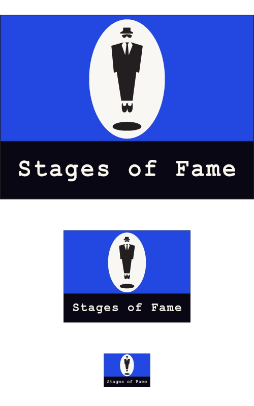
This design represents a company logo for Stages of Fame, a theatric production company. This design was challenging because it was important that it was visually appealing not only at a regularly formatted size, but also at a very small size. Like most logos, it was simple and effective through contrasting color with an easy translation of its only message. The bold colors of royal blue alongside black and white allowed for a clear understanding of the message, even at a glance. It was evident that the man on stage represented the entire theme of the company. The clean lines and bold, simple font are both great ways to grab the attention of a customer. Not only is the logo visually appealing in color, its strong contrasting images translated nicely into a black and white format.
The message intended for the audience was that this theater company is professional and focuses on the quality of each individual actor. This theme is represented by the single actor on stage, with a spotlight shining down to highlight his ability. At a glance, I feel that a person would feel the same message conveyed above.
Since the design was clean and simple, basic design elements were required. For example, lines provided an effective way to draw attention to the viewer’s eye. Also, it was important to keep the logo simple and bold, as to grab attention rather than confuse a viewer.
Overall, this design was creative and proved to be visually appealing at all three sizes.