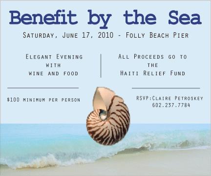
This design advertises Benefit by the Sea, which is an upscale fundraising event hosted to raise money for the Haiti Relief Fund. Since the requirements were to use a default page the size of a postcard, this assignment required creativity while designing a simple, effective message. There are multiple techniques that were used to ensure visual appeal as well as readability. First of all, there is excellent symmetry among each frame of text. There are even lines to separate the Who, What, Where, How, and Why? of the advertisement. The font is also simple and elegant which follows the theme of the event. As for graphic images, only two were used which was beneficial since the postcard required mostly informative text. A simple ocean wave acted as the bottom frame of the background layer, while the seashell acted as a focal point which tied everything together nicely.
The message to the intended audience was effectively communicated because the advertisement represents the elegance and class of the actual event. Crisp lines and fresh colors are a great way to give the viewer a taste of what to expect at the actual benefit.
Various design elements were used in the production of this advertisement. Here are some examples of a few of them: Photoshop was used to format the images that were found on the internet. The Magic Wand Tool was helpful in isolating the images. Also, Leading was a helpful tool in creating consistent spacing between fonts. Layers tool was very helpful in creating this advertisement as well.
Overall, this advertisement applied design elements in order to create a visually appealing end product. It provides sufficient information as well as peaks interest about the importance of raising money for people in need.